
Draw a process map your team can read
In a visual QMS, the documents and requirements are linked to the boxes on the process map. Here is how to draw one layer by layer, from the company top level down.

In this article
A new colleague asks how a particular job is done here, and the answer depends on who you ask. The visual process map is where that answer should live. Each box can carry the documents, notes and requirements that apply to that job, so the map is also the way into the rest of the quality system. This part of the Getting started series is about drawing a map your staff can read and follow.
Choose a notation people can read#
When you map your company’s processes, what matters most is that the people who use the map can understand it. Otherwise the effort goes to waste.
There are many ways to draw processes. We recommend UPN (Universal Process Notation), an intentionally simple notation. The map is split into layers so each screen stays easy to read, and every box has room for links and attachments.
Work from the top down#
Start at the top level of responsibility and work downwards. Process owners and their people map their areas as they work today.
Mapping is usually done in workshops. The project team learns UPN and the web tool while it captures the processes, one layer at a time.
Level 1: the company on one screen#
The first milestone is the top level of the company: one diagram of how the organisation runs, which gives everyone the same overview. Inspired by the APQC model, it has a box for each process area. Arrows show what passes from one area to the next, and the role responsible for each area is named at the bottom of its box.
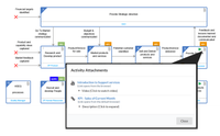
People click a box to go down to the next level. How deep you map each area depends on many things, and it is worth balancing what the diagram shows against what the attached documents explain.
Level 2: one diagram for each process area#
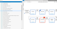
Next, draw the top level of each process area. Depending on your organisation, an area can be as detailed as the company level, or much simpler. An HR area may need only a handful of boxes.
Level 3 and below: only as deep as people need#
Below the process areas, go into the individual activities, down to a single role where that helps. How far each area goes depends on how much its process owner and staff put in, and deeper is not always better.
Sometimes an extra level explains an activity well. For detailed instructions, a link on the box to an instruction or a short video usually explains it better than another diagram. Each screen should tell the reader something useful.
Link each box to its guidance#
The map earns its keep through its links. Connect each activity to the controlled documents and requirements that guide it, so a person on any box reaches the guidance they need in one click.
A link can point to the latest approved version of a document, so updating a procedure does not mean redrawing the diagram.
Let the workshops find the gaps#
Workshops tend to turn up questions nobody has asked, such as what happens between Sales and Delivery, and whether there is a handover at all.
Once you have gone as deep as your people need, the map is ready to launch. From then on, keep the map and the content linked to it up to date.
Next in the series: build a document library that stays under control.
Book a demo and we open a finished map and click down through the layers with you. If you have a process you are unsure how to map, write to sales@solutionmanagement.eu and we answer the same working day.